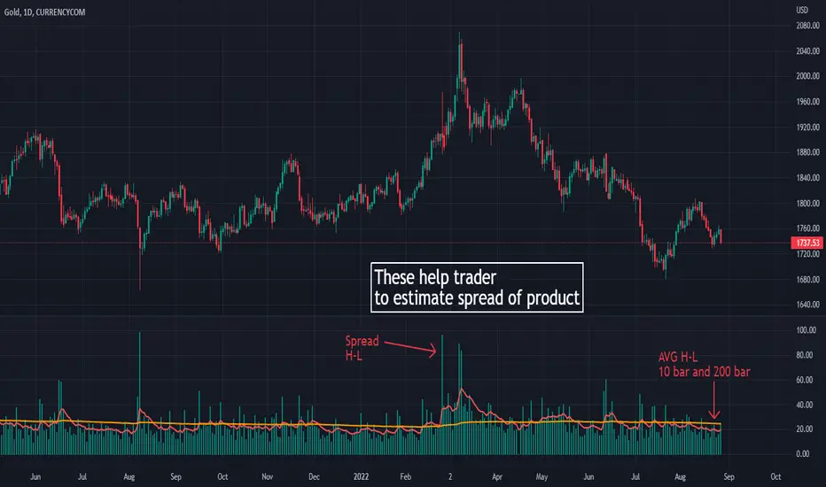
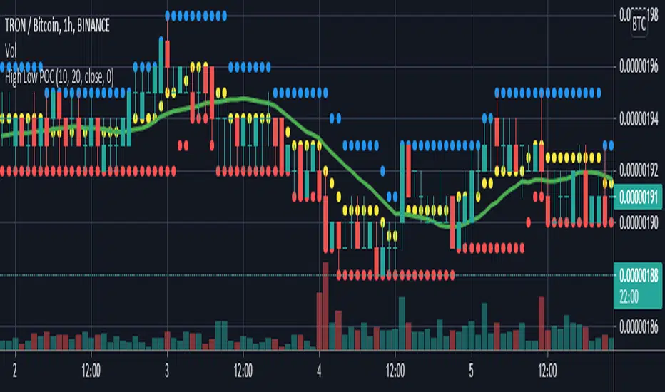
High low volatile
its purpose to make this script is learning how many spread on each product.
its help trader and me to estimate spread of High and low for make a better trade
Money management :
Its also useful to help trader to manage number of lot to take a risk on that trade
How it work?
I use High and low to calculate the different between on them
and I add an EMA 10 and EMA 200 to estimate spread of each product in many bar
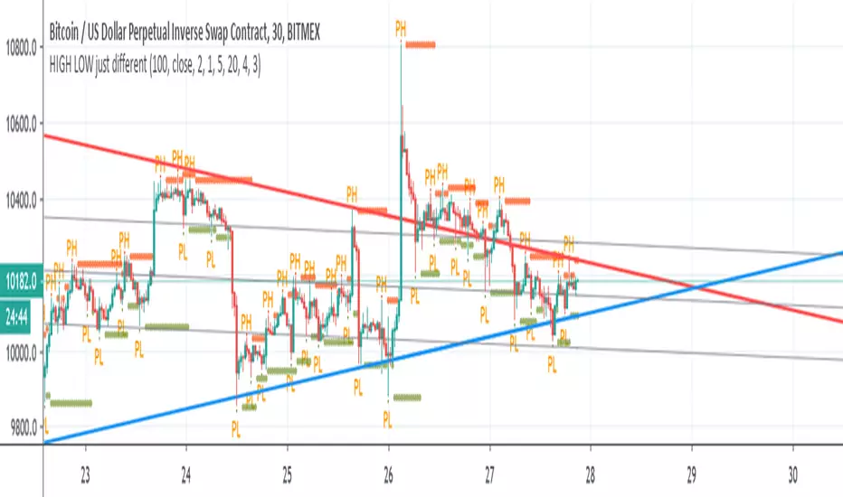
On second picture , I use it on GOLD 1H timeframe . You can see that Gold in hour trade on my country time (thailand) It has more spread on 19.00-23.00 pm (in US time is 7.00-11.00)
It help trader to set time when to trade and when to leave
thank you
Pine Script® インジケーター